Freelance Digital Design Project

How can a redesign assist with boosting engagement?
A PV19 Fund Landing Page Redesign
My Scope: UX/UI, Content Design, Web Design
The PV19 Fund is a local scholarship to Sterling, VA, that provides a $2,500 scholarship to one Park View High school graduating senior. Started by alumnus, they released a website application in 2023 for their first scholarship cycle, using Wix to DIY their website design. The original site had usability issues, lack of CTA, and inconsistent web design.
Scholarship applicants dropped by 90% over the past two years. I redesigned three priority landing pages - Home, Apply, and Submission. I focused on the improving the flow of submitting an application and clearer CTAs to apply.
Project Background
This is a unique scholarship, so why aren’t students applying?
To understand the issues of the websites, I analyzed the current flow of the website to understand pain points as a student. The previous website had prioritized pushing as much content possible and compartmentalized features to one landing page per feature. Additionally, the organization had surveyed applicants to receive feedback on the application process. They found that students thought that the essay process was too long, which demotivated students from applying.

After my analysis, I found that there are 2 areas that must be addressed to boost the applicant engagement.
Clearer call-to-action for applying.
Separate user flows based on submission.
Clearer call-to-action for applying.
The Home page now has a button to the apply page as the first announcement in the strip. Additionally in the Apply page, there are now two sets of buttons for the online/physical applications. These new calls-to-action better navigate the user to the application.

Separate user flows based on submission.
When the user clicks Apply Online, they will now be asked whether they want to do a written essay or video format. Separating these two submission types will make the application look less time-consuming. There will be less pain points where users are confused into thinking they need to submit both a video and an essay.
Additionally, simple UI adjustments—like positioning the Upload Files button near the top and including a short explanation of what documents are needed—will give users clearer guidance on where to upload transcripts, references, and other supporting materials.

Design Comparison

Original Home Page
In the original design, there was no clear Call-to-Action for a student to apply to the scholarship.
The countdown doesn’t give a direction on where to navigate after seeing the time run out.
ReDesigned Home Page
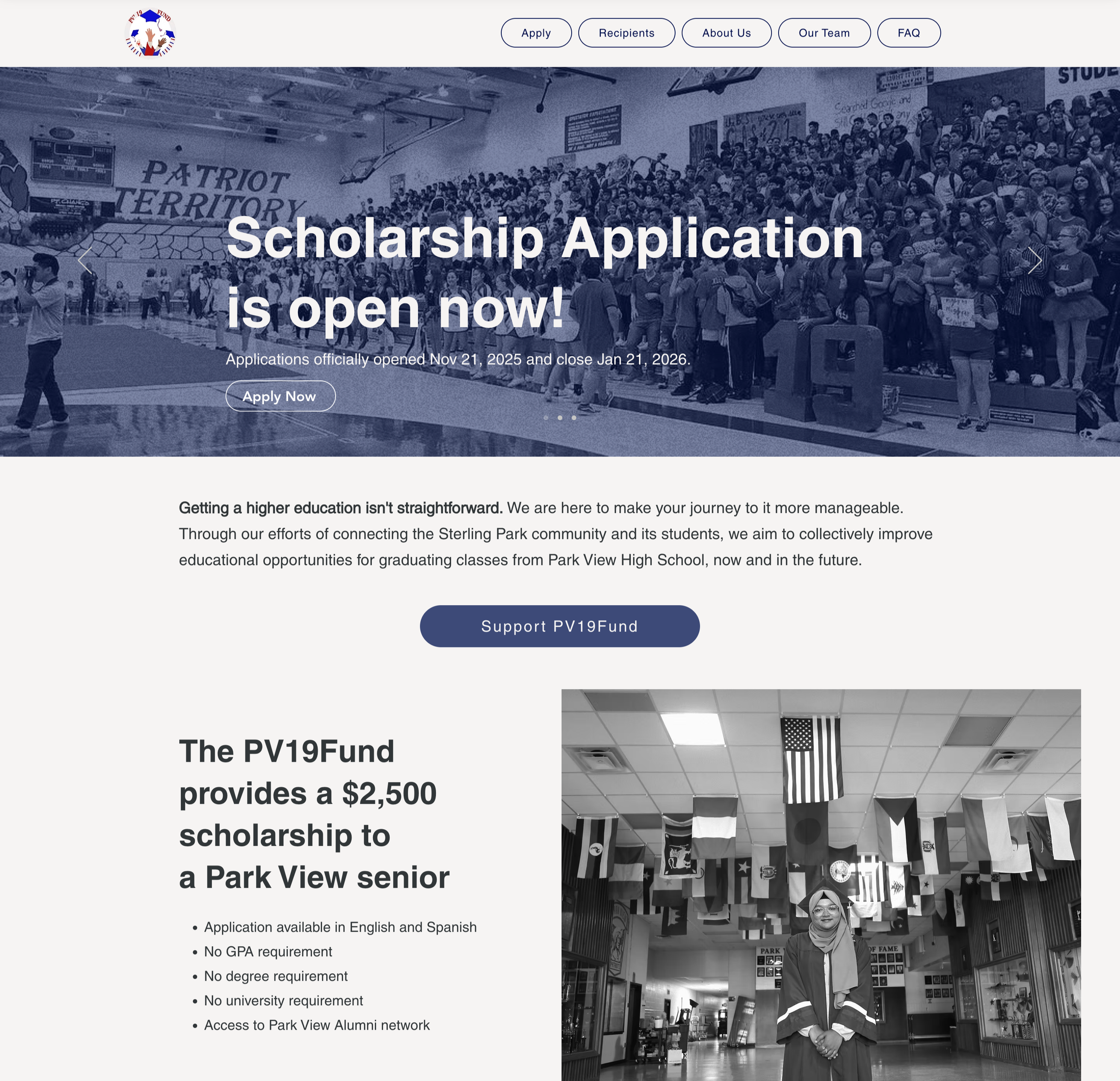
The ReDesign replaces the original gallery with announcements to guide users in the intended flow.
Additionally, the description section provides reasons to apply and a direct link to the application.
Original FAQs

In the original design, the FAQs appeared as long text blocks, which can feel overwhelming for users—especially when they don’t need every answer at once. This format also uses space inefficiently, as the lengthy questions and answers take up a large portion of the page.
ReDesigned FAQs


The redesign organizes FAQs into specific sections—the Home page and the Apply page—to prevent users from feeling overwhelmed by too many questions at once. Users can also expand or collapse each answer, allowing them to view only the information that’s relevant to them.
Original Apply Page

In the original design, the Apply page had a completely different visual design compared to all of the other pages.
Additionally, the text formatting feels clunky, and it is not clear what is the primary button because they’re both an alarming red.

ReDesigned Apply Page

The ReDesigned Apply page now shows a timeline, status, and utilizes primary and secondary button for the application.
Additionally, there is more reasoning as to why a student should apply to the scholarship, and it gives them information about the fund.


